HEURISTIC EVALUATION CRITERIA
We used Nielsen Norman Group’s 10 Usability Heuristics for User Interface Design

Enhancing world's #1 job search platform
Heuristic evaluation research focusing the resume builder user flow of the indeed platform - on the mobile app as well as the desktop website
TIMELINE 20 weeks
DISCIPLINE
-
User Research
-
User Interviews
-
Survey development
TEAM
-
Divya Agarwal
-
Chiayu Hu
-
Rachel Kim
-
Sanika Chitnis
ABOUT THE PROJECT
A team of 5 members reviewed static screens of the ‘resume builder’ feature of the indeed platform. For the evaluation, we used Nielsen Norman Group’s 10 Usability Heuristics for User Interface Design. Each individual reviewed both - the mobile app as well as the desktop website. For the mobile app, the choice between android and iOS interface was based on availability.
Further, in order to dive deeper into the research, we conducted usability testings where we recruited 10 users who haven't used the application before and asked them to complete a set of tasks. We evaluated and compared the desktop and mobile interface through analysis based on SUS Scoring, time on tasks and differences in average time on tasks.

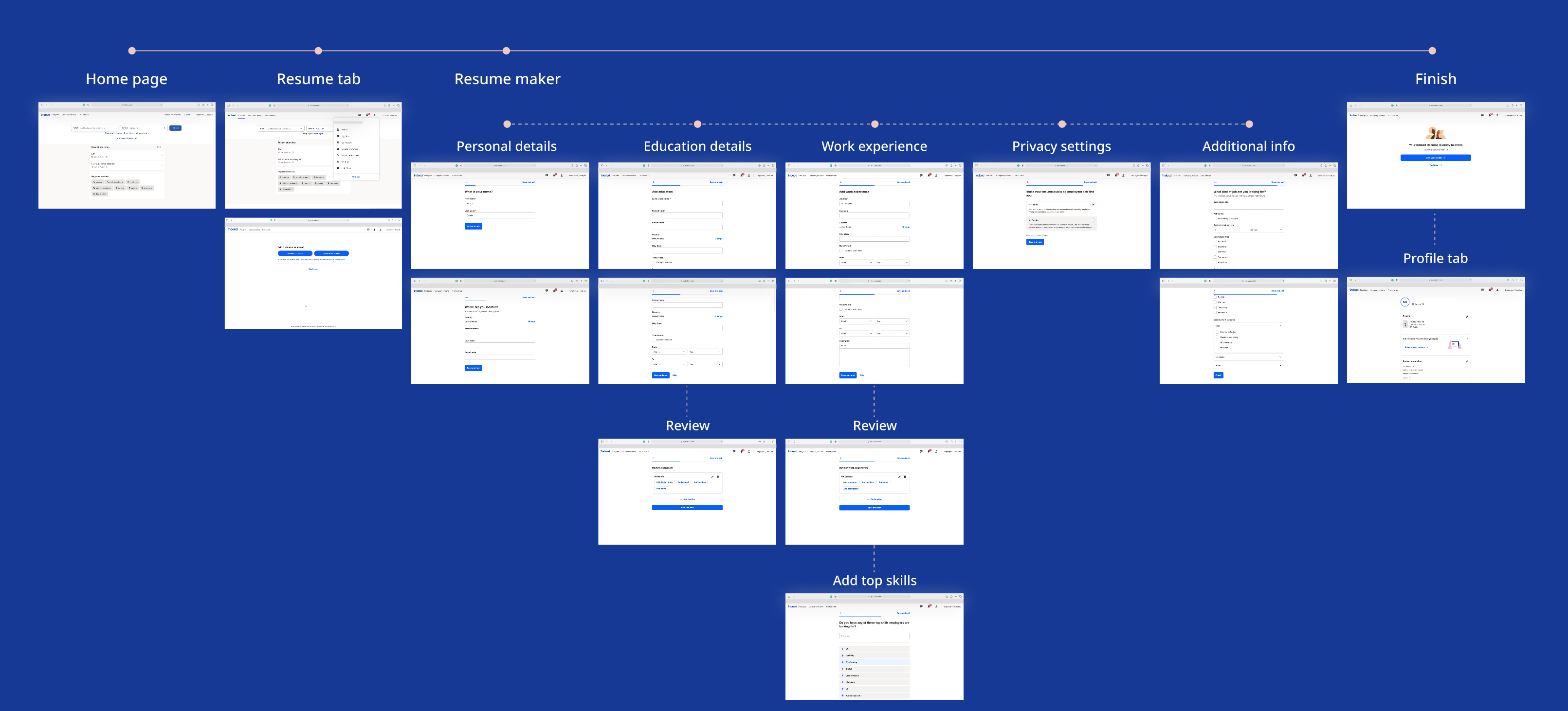
USER FLOW
Our preliminary research helped us understand that users prefer to use the desktop website to build their resumes on Indeed. which led us to ask - even though we as designers use the mobile-first approach to design for our next billion users, why is it that the case?
Why focus on both desktop and mobile interfaces?
-
The target users - students are more likely to be on their mobile devices than on desktops.
-
Notifications triggered on the mobile applications help users stay updated at all times.
-
About 50% of internet traffic comes from mobile phones. (source: https://techjury.net/blog/mobile-vs-desktop-usage/#gref)
-
Mobile applications provide an ‘edit-on-the-go’ option.
Further, we went ahead to analyze each screen of the user flow while simultaneously comparing them across devices, we also rated these evaluations from a 0 to 5 scale. If we found that any heuristic was followed really well in the screen we gave it a green 0, the rest 1-5 scale is for poor usability heuristic in the poor to the poorest order. Here are a few insights from the report we compiled -
HEURISTIC EVALUATIONS


For more information check out the entire HE report here
DESKTOP + MOBILE
RESEARCH ROADMAP

OBJECTIVE
Check if the users successfully complete the resume-building process of the Indeed platform and compare user preferences between mobile and desktop devices.
EVALUATING USING USABILITY TESTINGS


INSIGHTS FROM USER TESTINGS


SYSTEM USABILITY SCALE
Users preferred using desktop over mobile application. The experience on desktop was fairly consistent across users.
TIME ON TASK
7/8 users took relatively less time to create a resume on the desktop. The difference in time can be attributed to the ease of typing that the desktop provides over mobile. It also talks about the relative ease of navigating the website over the mobile application.

DIFFERENCE IN AVERAGE TIME ON TASK
On an average, for 8/9 tasks users took relatively less time on desktop than the mobile app.

INFERENCES AND EVALUATIONS
Using data collected during the usability testing, we quantitatively analysed and compared the two interfaces.